Flask 기초
04 Matplotlib 데이터 시각화
Status: In progress
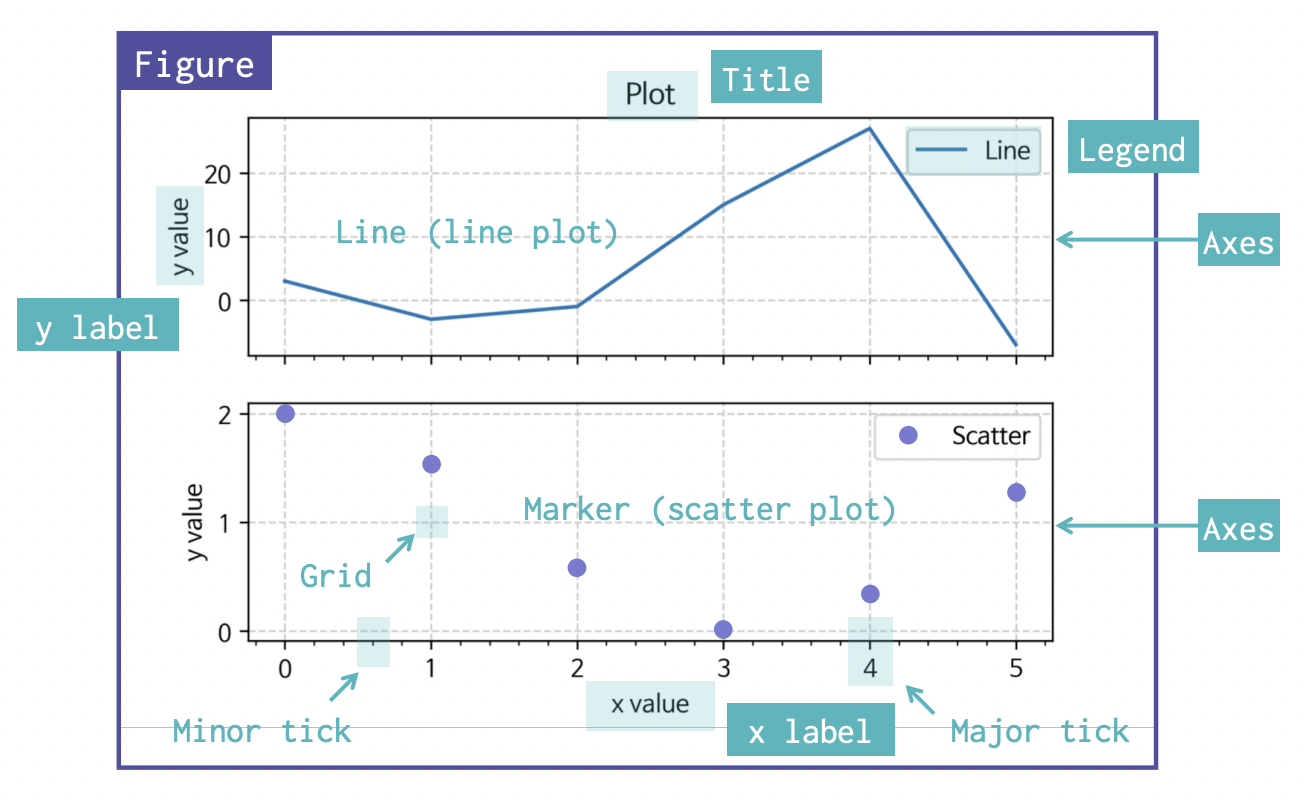
Matplotlib
: 파이썬에서 데이터를 그래프나 차트로 시각화할 수 있는 라이브러리다.
그래프 그리기
-
state-machine interface
import matplotlib.pyplot as plt

x = [1, 2, 3, 4, 5]
y = [1, 2, 3, 4, 5]

plt.plot(x, y)
plt.title("First Plot")
plt.xlabel("x")
plt.ylabel("y")

-
object-oriented interface
import matplotlib.pyplot as plt

x = [1, 2, 3, 4, 5]
y = [1, 2, 3, 4, 5]

fig, ax = plt.subplots() # fig, ax 객체 생성
ax.plot(x, y)
ax.set_title("First Plot")
ax.set_xlabel("x")
ax.set_ylabel("y")
object-oriented interface 방식이 직관적이기 때문에 선호한다.
Matplotlib 구조
그래프 저장
fig.set_dip(300)
# set_dip은 해상도를 나타내는 것으로 보통 300으로 하면 된다.
fig.savefig("그림파일.png")
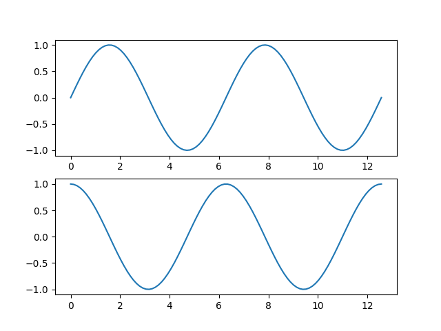
하나의 figure에 여러 그래프(axes) 그리기
x = np.linspace(0, np.pi*4, 100)

fig, axes = plt.subplots(2, 1) # (행, 열)
# fig (도화지) 크기 설정
# fig, axes = plt.subplots(1, 2, figsize=(8, 4))

axes[0].plot(x, np.sin(x))
axes[1].plot(x, np.cos(x))
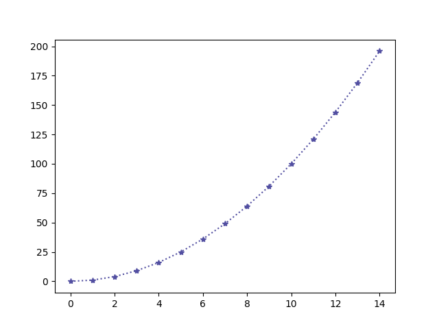
Line plot
fig, ax = plt.subplots()
x = np.arange(15)
y = x ** 2
ax.plot(
	x, y,
	linestyle=":",
	marker="*",
	color="#524FA1"
)
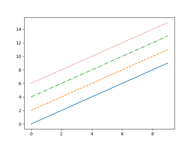
Line style
x = np.arange(10)
fig, ax = plt.subplots()
ax.plot(x, x, linestyle="-")
# solid
ax.plot(x, x+2, linestyle="--")
# dashed
ax.plot(x, x+4, linestyle="-.")
# dashdot
ax.plot(x, x+6, linestyle=":")
# dotted
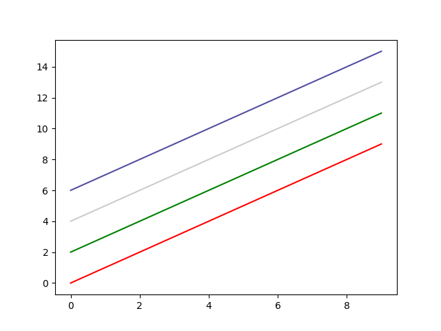
Color
x = np.arange(10)
fig, ax = plt.subplots()
ax.plot(x, x, color="r")
ax.plot(x, x+2, color="green")
ax.plot(x, x+4, color='0.8')
ax.plot(x, x+6, color="#524FA1")
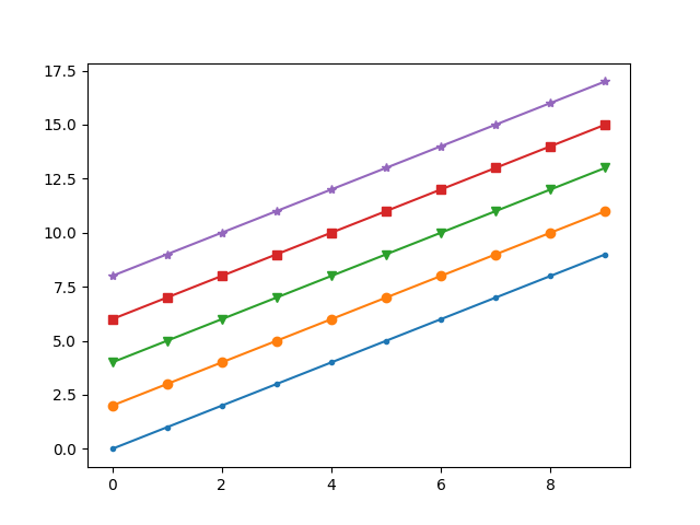
Marker
x = np.arange(10)
fig, ax = plt.subplots()
ax.plot(x, x, marker=".")
ax.plot(x, x+2, marker="o")
ax.plot(x, x+4, marker='v')
ax.plot(x, x+6, marker="s")
ax.plot(x, x+8, marker="*")
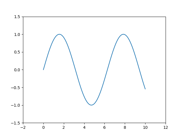
축 경계 조정하기
x = np.linspace(0, 10, 1000)
fig, ax = plt.subplots()
ax.plot(x, np.sin(x))
ax.set_xlim(-2, 12)
ax.set_ylim(-1.5, 1.5)
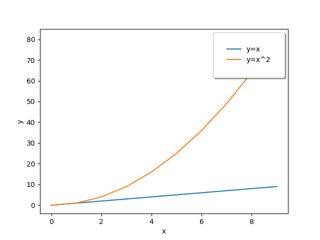
범례
fig, ax = plt.subplots()
ax.plot(x, x, label='y=x')
ax.plot(x, x**2, label='y=x^2')
ax.set_xlabel("x")
ax.set_ylabel("y")
ax.legend(
	loc='upper right', # lower left /center
	shadow=True,
	fancybox=True, # 모서리
	borderpad=2 # 박스 테두리
)
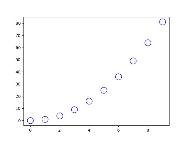
Scatter
fig, ax = plt.subplots()
x = np.arange(10)
ax.plot(
	x, x**2, "o",
	markersize=15,
	markerfacecolor='white',
	markeredgecolor="blue"
)
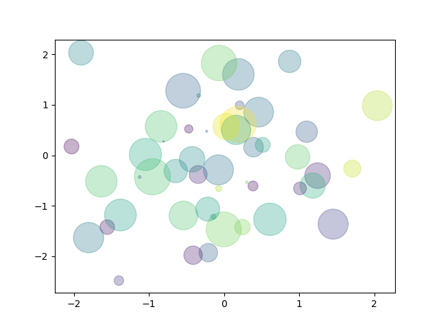
fig, ax = plt.subplots()
x = np.random.randn(50)
y = np.random.randn(50)
colors = np.random.randint(0, 100, 50)
sizes = 500 * np.pi * np.random.rand(50) ** 2
ax.scatter(
	x, y, c=colors, s=sizes,
	alpha=0.3
)
tip
matplotlib 의 pyplot으로 그래프를 그릴 때, 기본 폰트는 한글을 지원하지 않습니다.
한글 지원 폰트로 직접 바꾸어주면 한글을 사용하실 수 있습니다.
아래는 한글을 지원하는 나눔바른고딕 폰트로 바꾼 코드입니다.
import matplotlib.font_manager as fm
fname='./NanumBarunGothic.ttf'
font = fm.FontProperties(fname = fname).get_name()
plt.rcParams["font.family"] = font
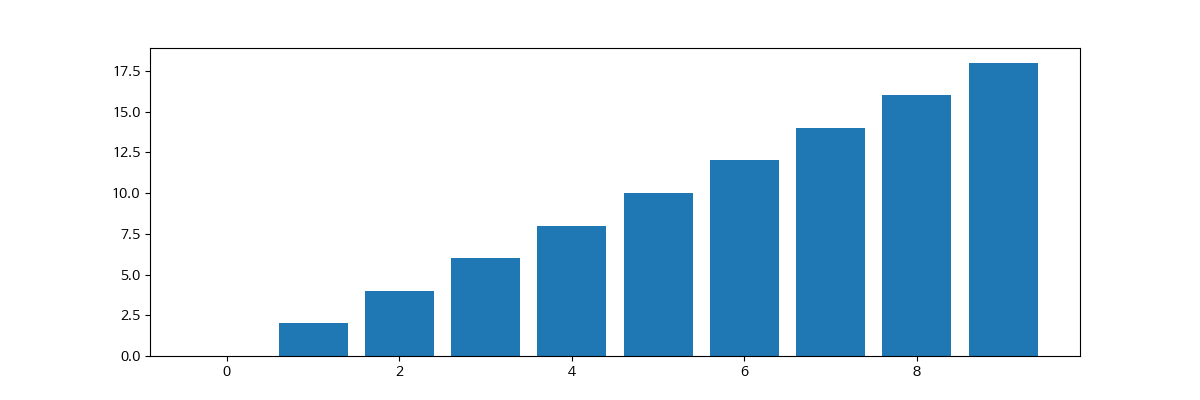
Bar & Histogram
# bar
x = np.arange(10)
fig, ax = plt.subplots(figsize=(12, 4))
ax.bar(x, x*2)
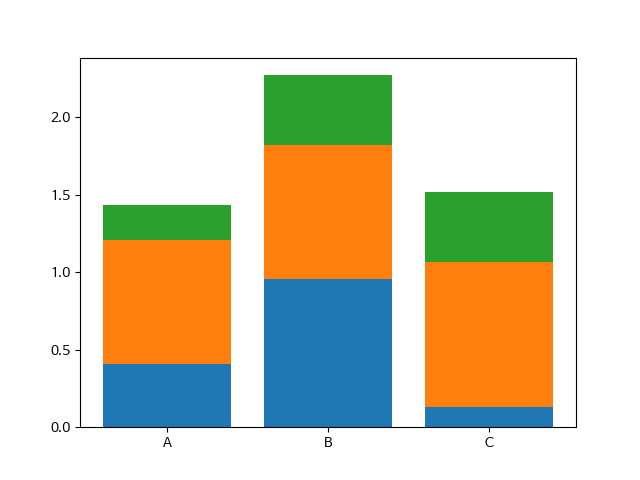
누적 바 그래프
x = np.random.rand(3)
y = np.random.rand(3)
z = np.random.rand(3)
data = [x, y, z]

fig, ax = plt.subplots()
x_ax = np.arange(3)
for i in x_ax:
	ax.bar(x_ax, data[i],
				 bottom=np.sum(data[:i], axis=0))
ax.set_xticks(x_ax)
ax.set_xticklabels(["A", "B", "C"])
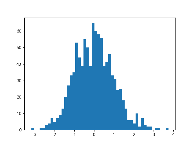
fig, ax = plt.subplots()
data = np.random.randn(1000)
ax.hist(data, bins=50)
Matplotlib with Pandas
df = pd.read_csv("./president_heights.csv")
fig, ax = plt.subplots()
ax.plot(df["order"], df["height(cm)"], label="height")
ax.set_xlabel("order")
ax.set_ylabel("height(cm)")
ax.legend()
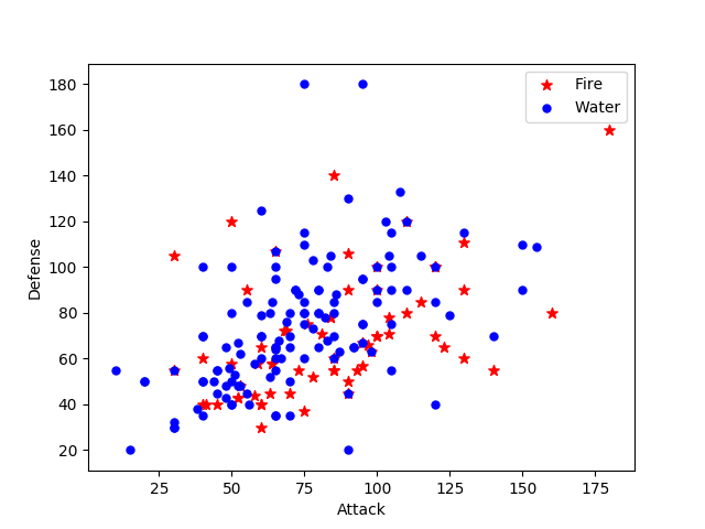
df = pd.read_csv("./data/pokemon.csv")

fire = df[
    (df['Type 1']=='Fire') | ((df['Type 2'])=="Fire")
]

water = df[
    (df['Type 1']=='Water') | ((df['Type 2'])=="Water")
]

fig, ax = plt.subplots()
ax.scatter(fire['Attack'], fire['Defense'],
    color='R', label='Fire', marker="*", s=50)
ax.scatter(water['Attack'], water['Defense'],
    color='B', label="Water", s=25)
ax.set_xlabel("Attack")
ax.set_ylabel("Defense")
ax.legend(loc="upper right")
댓글남기기